Zuuz App Redesign
The challenge
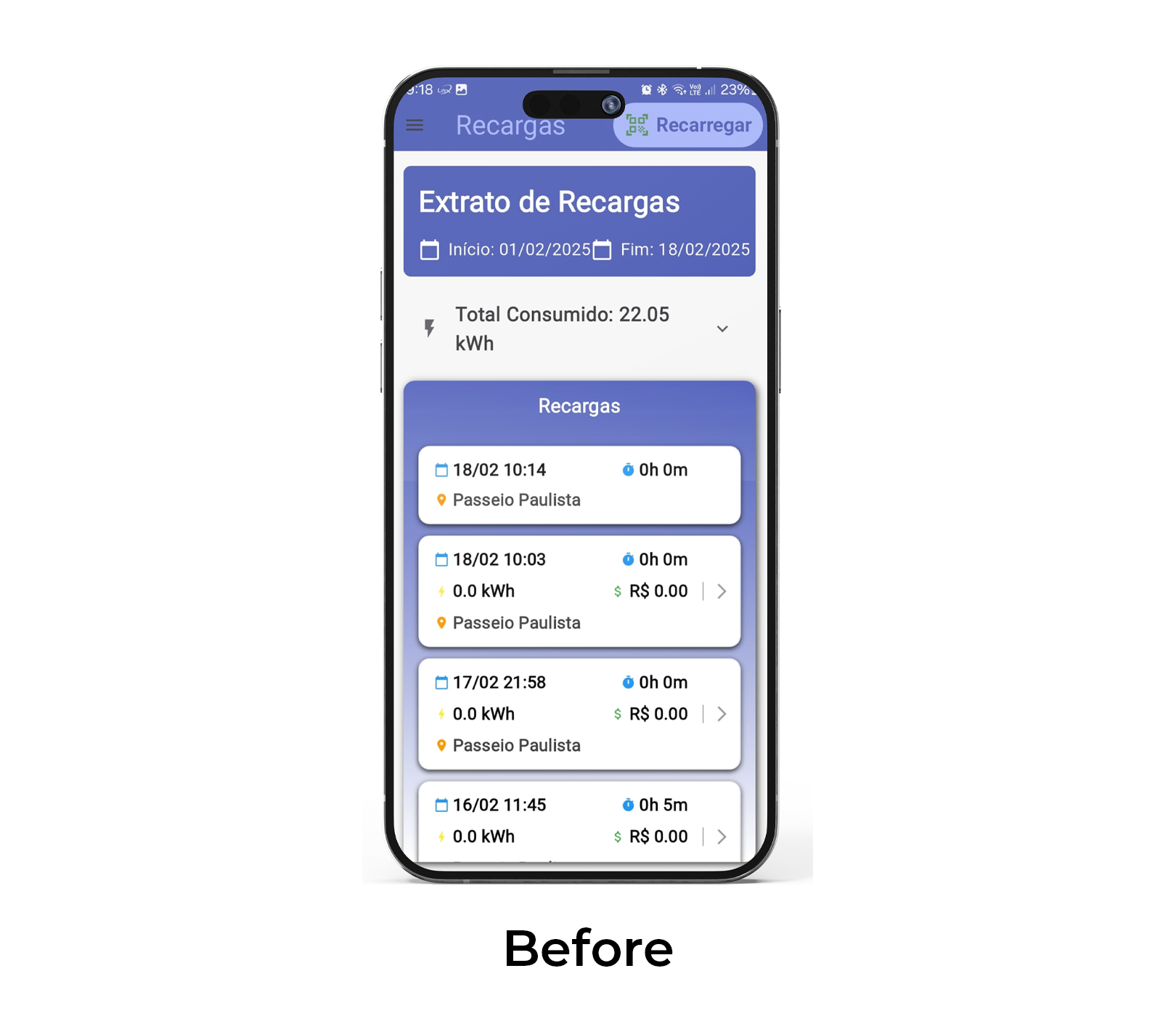
Zuuz’s existing charging app contained all the necessary functionality but presented it through a dense, difficult-to-navigate interface. Important information such as energy consumption, recharge history, and costs was hard to scan and interpret quickly.
The challenge was to redesign the app to make complex charging data easier to understand while improving usability for both frequent and first-time users.
Work Overview
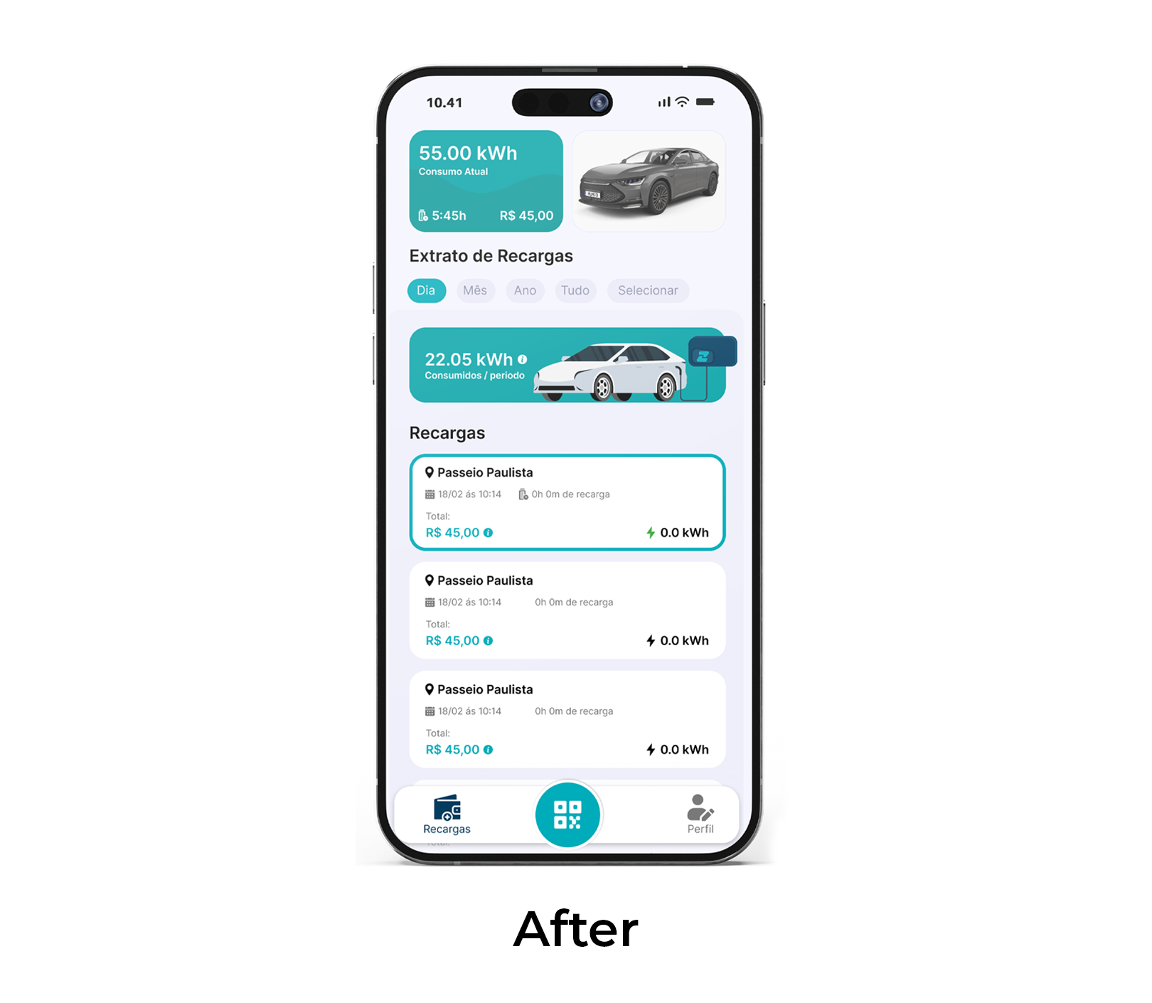
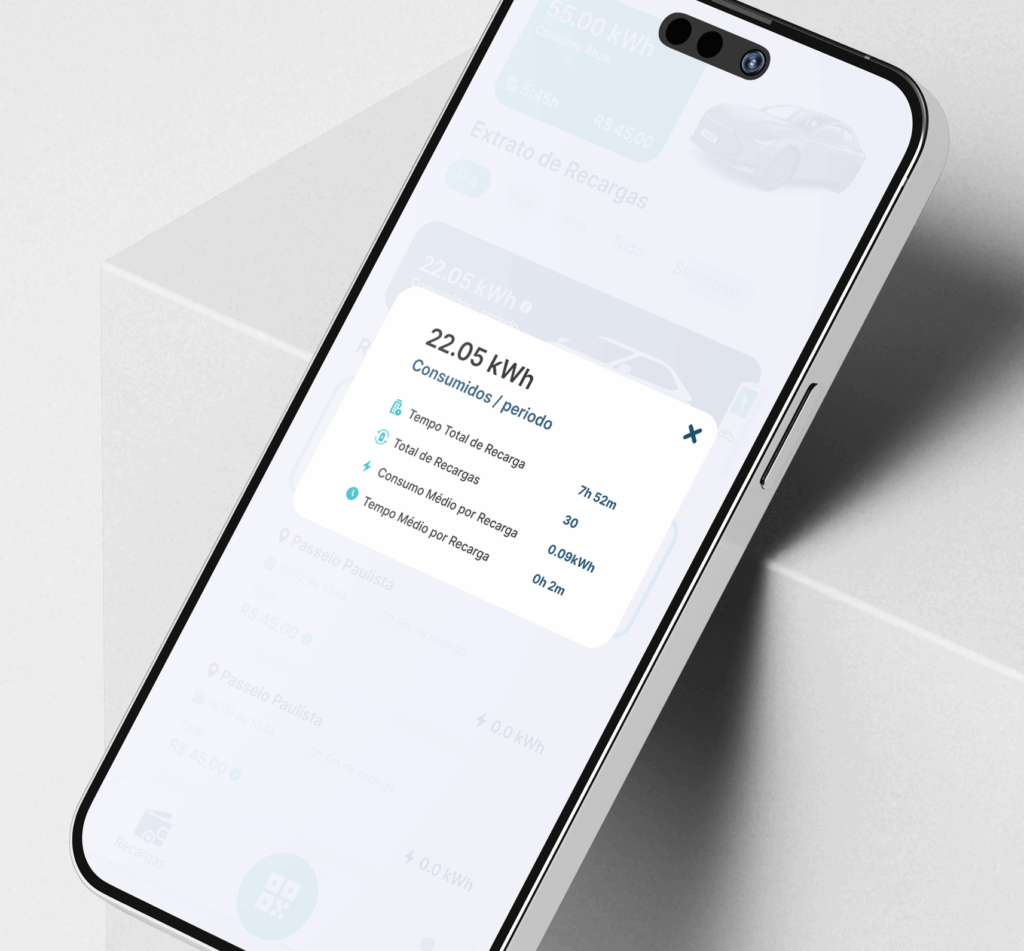
The redesign focused on simplifying information hierarchy and reducing cognitive load. Data-heavy screens were restructured into clear sections, with visual emphasis placed on key metrics such as kWh consumed, cost, and recharge duration. Color, spacing, and card-based layouts were used to improve scannability, while icons and visual cues helped users quickly distinguish between actions, summaries, and detailed views.
1
2
3
4
5
6
7
8
9
0
1
2
3
4
5
6
7
8
6
5
1
2
3
4
5
6
7
8
9
%
Reduction in Competing Accent Colors
1
2
3
4
5
6
7
8
9
0
1
2
3
4
5
6
7
8
3
5
1
2
3
4
5
6
7
8
9
%
Increase in White Space
1
2
3
4
5
6
7
8
9
0
1
2
3
4
5
6
7
8
4
5
1
2
3
4
5
6
7
8
9
%
Faster Content Scanning
1
1
2
3
4
5
6
7
8
9
0
1
2
3
4
5
6
7
8
0
0
1
2
3
4
5
6
7
8
9
%
Design Standardization
THe Result
The updated design transforms a previously cluttered interface into a clear, user-friendly experience. Key information is now visible at a glance, navigation is more intuitive, and users can easily move between summaries and detailed recharge data.